Layers, focus, and controls
This page describes the panel’s controls. For a task-based walkthrough, start with Understand a page.
Open DevTools on a React page and choose Anatomy, possibly under the » menu. The first capture happens automatically. Undock DevTools when you need more room.
Separate the page
Section titled “Separate the page”Explode view separates the rendered page into layers. Drag to orbit, scroll to zoom, and use Front to look straight at the page again.
Separation controls the distance between planes. It does not change which components appear.
Start with Auto depth
Section titled “Start with Auto depth”Layer depth starts in Auto. It explores each visible region independently, so a shallow sidebar does not prevent a deeply nested main layout from appearing.
Intermediate containers and smaller details can stay painted inside a visible parent. They are still in the component tree: selecting a component reveals its plane. Focus subtree gives you a closer overview, including smaller local details.
Moving the depth slider chooses a uniform manual cutoff. Move it left to group more output into parents; move it right to separate deeper layers. Click Auto to restore the overview.
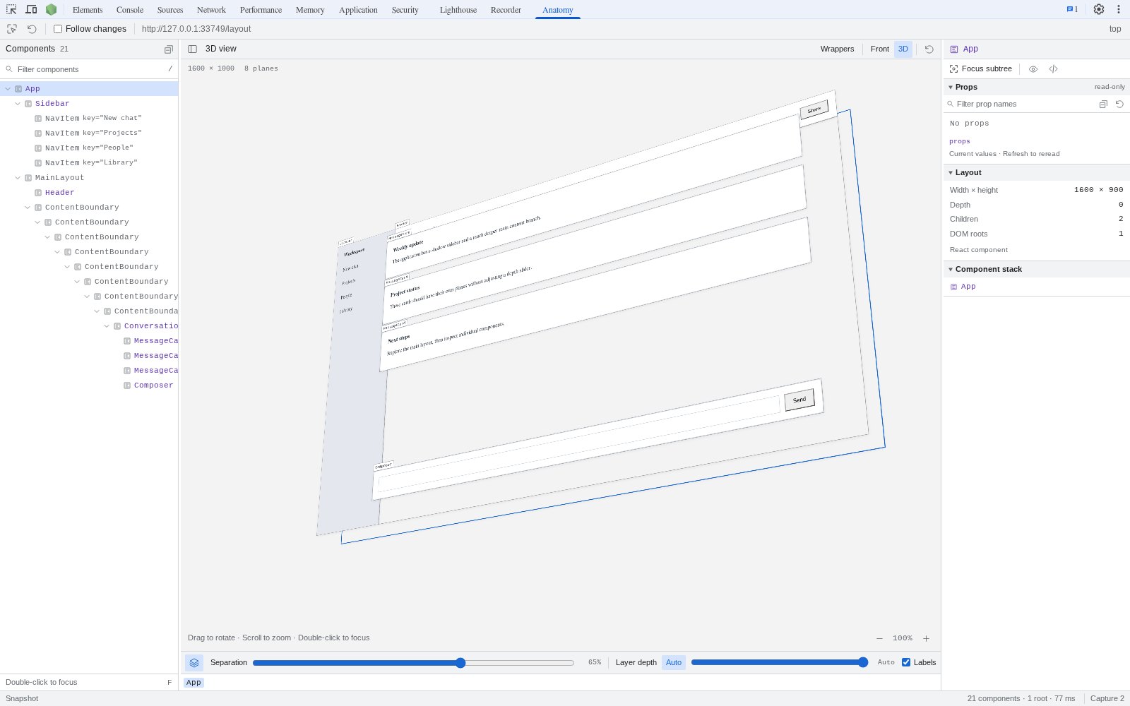
Auto depth follows each visible branch independently. The main layout is still visible beneath a deep chain of containers.
Why wrappers share a plane
Section titled “Why wrappers share a plane”Several React components can render exactly the same DOM output. Showing each as a separate plane can bury the useful layout under provider and wrapper layers.
React Anatomy combines those planes by default. Each component still has its own tree row and props. Enable Wrappers to separate them; this also switches to manual depth. The layer count can therefore differ from the component’s original React nesting depth.
Select and focus
Section titled “Select and focus”- Click a plane or tree row to select a component.
- Use Pick on page to select its visible output in your actual app.
- Double-click a component, use Focus subtree, or press F to focus it.
- Use the breadcrumbs or Escape to return to the broader view.
- Highlight on page shows where the selected component came from.
- Reveal in Elements opens its DOM output in the browser’s Elements panel.
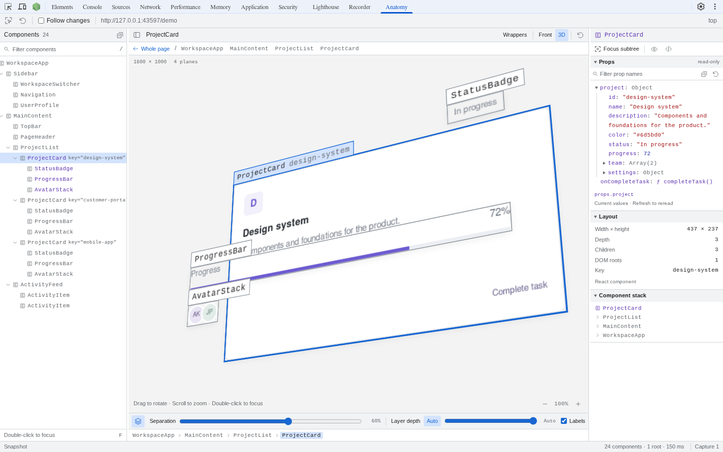
Focus subtree makes the card’s smaller children easier to see. Use Whole page above the scene to return to the overview.
Keep a capture current
Section titled “Keep a capture current”With Follow changes on, rendered DOM, scrolling, and viewport changes trigger a new capture. With it off, the panel marks the capture when the page changes. R captures again.
Props can change without a DOM change. Use Refresh props in the inspector for those updates.
Keyboard controls
Section titled “Keyboard controls”| Key | Action |
|---|---|
| Arrow keys | Navigate and expand the component tree |
| F | Focus the selected component |
| Escape | Return from focus or cancel page picking |
| R | Capture again |
| C | Toggle the page picker |
| / | Focus component search |
| 0 | Reset the view |
Shortcuts leave text inputs alone. Reduced-motion preferences disable animated transforms.